

my photos
PLANT COMBINATIONS ONE
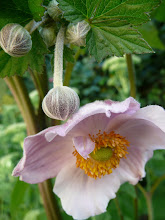
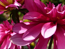
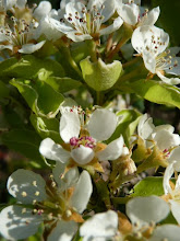
From time to time in my garden I accidentially stumble upon a great plant and colour combination. Above you can see steely blue sea holly (eryngium), which is a warm colour, growing alongside vivid orange crocosmia, which is a cool colour, coming from opposite sides of the colour wheel, but equally winning one's attention.
A colour from one side forms a contrast with a colour on the opposite side of the colour wheel. The most intense contrasts are between colours that lie directly opposite one another, ie blue with orange.

The Gardener's Book of Colour is one of my favourites. Andrew Lawson with his artist's eye and scientist's training, shines a new light on using colour in the garden. Authoritative and accessible, this book will stimulate your imagination and put exciting new ideas within your grasp. It is a book no gardener will want to put down, which includes me!


14 comments:
Such a pleasing colour combination! Back here in the tropics green just goes with green! :D
Gorgeous colour combination. Orange crocosmia grows wild here in Penwith all over the place! The zingy colours are so uplifting.
Another book to add to my ever growing must have books list Louise! xx
The colour is lovely! really pretty. I do love vibrant colours in the spring and summer. For some reason I think they would look out of place in the Autumn and winter... I think the browns, greens and reds and of course the white fit the seasons! Mix the summer colours with the butterflies and the you have a rainbow!
Awesome colour combination, Louise. Just gorgeous. I think I need to take a look at that book myself. I tend to throw plants into the garden without considering colour. I look at height and weirdness factors...
I do love the blue and orange - really stunning together :) I do enjoy seeing your garden, Catherine x
Beautiful..the colours go really well together ;-)
That's a fine colour combination! They look fine under sunny or grey skies.
Those colours look fantastic together!
I was immediatly pulled into the first picture by the color, beautiful!
These colours look fantastic together. I often use a colour wheel in scrapbooking and go for the contrasting colours.
I love crocosmia, and try to use them in sheltered gardens here in New York, though they're a bit iffy on rooftops with windchill. The powder blue looks lovely against them or vice versa...
Near my parent's house in Constantia, Cape Town, they have naturalized under a stand of massive poplars above a stream. I miss those ones. In bloom round about now, I think.
I agree on the great color combination, in addition - beautiful flowers and foliage!
That is a highly interesting combination, quite striking against the green. I'm still at the 'basics' level but mother nature sure knew what she was doing when she provided a mostly green backdrop for the world's flowers.....
Nature, by design!
Post a Comment